• Skip to main content
itrc_logo

Geospatial Analysis for Optimization at Environmental Sites

Navigating this Website
Overview
Fact Sheets
Fact Sheets Overview
Fact Sheet 1: Do You Need Geospatial Analysis?
Fact Sheet 2: Are Conditions Suitable for Geospatial Analysis?
Fact Sheet 3: How is Geospatial Analysis Applied?
Fact Sheet 4: What Software is Available to Help?
PM's Tool Box
PM's Tool Box Overview
Review Checklist
Choosing Methods
Common Misapplications
Optimization Questions
Geospatial Analysis Support for Optimization Questions in the Project Life Cycle
Data Requirements
General Considerations
Methods for Optimization
Geospatial Methods for Optimization Questions in the Project Life Cycle Stages
Release Detection
Site Characterization
Remediation
Monitoring
Closure
Documenting Results
Fundamental Concepts
Fundamental Concepts for Geospatial Analysis
Basic Data Concepts for Geospatial Analysis
Interpolation Methods and Model Prediction
Uncertainty in Geospatial Analyses
Characteristics of Interpolation Methods
Work Flow
Work Flow for Conducting Geospatial Analysis
Geospatial Analysis Work Flow Overview
Perform Exploratory Data Analysis
Select Geospatial Method
Build Geospatial Model
Evaluate Geospatial Method Accuracy
Generate Geospatial Analysis Results
Using Results
Using Analysis Results for Optimization
Plume Intensity and Extent
Trend Maps
Estimating Quantities
Hot Spot Detection
Sample Spacing
Estimating Concentrations Based on Proxy Data
Background Estimation
Quantifying Uncertainty
Remedial Action Optimization
Monitoring Program Optimization
Examples
Examples Overview
Example 1
Example 2
Example 3
Example 4
Methods
Methods Overview
Simple Geospatial Methods
More Complex Geospatial Methods
Advanced Methods
Index of Methods
Software
Software Overview
Software Comparison Tables
Software Descriptions
Workshops and Short Courses
Case Studies
Case Studies Overview
Superfund Site Monitoring Optimization (MAROS)
PAH Contamination in Sediments—Uncertainty Analysis (Isatis)
Optimization of Long-Term Monitoring at Former Nebraska Ordnance Plant (GTS; Summit Envirosolutions)
Optimization of Lead-Contaminated Soil Remediation at a Former Lead Smelter (EVS/MVS)
Extent of Radiological Contamination in Soil at Four Sites near the Fukushima Daiichi Power Plant, Japan (ArcGIS)
Optimization of Groundwater Monitoring at a Research Facility in New Jersey (GWSDAT)
Optimization of Sediment Sampling at a Tidally Influenced Site (ArcGIS)
Stringfellow Superfund Site Monitoring Optimization (MAROS)
Lead Contamination in Soil (ArcGIS)
Stakeholder Perspectives
Additional Information
Project Life Cycle Stages
History of Remedial Process Optimization
Additional Resources
Acronyms
Glossary
Index of Methods
Acknowledgments
Team Contacts
Document Feedback


Geospatial Analysis for Optimization at Environmental Sites
HOME

Perform Exploratory Data Analysis

EDA generally refers to a collection of descriptive and graphical statistical tools used to explore and understand a data set (see GSMC-1, Section 3.3.3). EDA includes descriptive statistics such as measures of centrality (mean, median), spread (standard deviation, variance, interquartile range), and shape (skewness and kurtosis), as well as graphical displays (histograms, box plots, scatter plots, and probability plots). The initial process of data evaluation should also include GIS-based mapping to compare available concentration data with site features, topography, current and historical operations, or other available geographic information. This section presents guidance on performing EDA, including the inherent assumptions, and strengths and weaknesses of each method, and how to understand the results that are generated.

▼Read more

General EDA tools allow you to check the quality and distribution of an entire data set and select appropriate statistical methods. Generally, spatial data are not completely independent; each measurement is correlated to some degree with its neighbors. Therefore, be suspicious of outliers in the entire data set, and also of observations that are unusual with respect to their neighbors. The overall distribution of the entire data set may also not be the appropriate distribution for spatially correlated data.

EDA allows visualization of the whole distribution in order to define the best model for each data set. Thus, it is possible to exclude abnormal data which may skew the results and add uncertainty or to observe the presence of subpopulations which may need to be modeled separately. It may also be advantageous to exclude data below the laboratory detection limit, especially if these data are not related to the contamination source. These choices, however, depend on the collected data on each site and the knowledge of the contamination properties (see GSMC-1 Section 5.7 for information about managing nondetect data). Removing or modifying the original data set must always be justified.

Common EDA Methods

The following standard EDA methods are typically used for an initial evaluation. Some of the methods are described in the GSMC-1 document, while others are covered in this document. The regression example includes examples of some of the plots.

  • summary statistics: mean, variance, skewness, and kurtosis of the data
  • scatterplots (GSMC-1, Section 5.1.3)
  • histograms (GSMC-1, Section 5.1.4)
  • probability plots, for example Q-Q plots (GSMC-1, Section 5.1.5)
  • distributional tests to evaluate the data for normality (GSMC-1 Section 5.6)
  • Pearson’s correlation coefficients (GSMC-1, Section 5.12.1)

▼Read more

While EDA helps to check assumptions about the distribution of a data set, the underlying assumption that the data are independent and identically distributed (i.i.d.) cannot be checked by a simple EDA. For example, an initial EDA may show that a spatial data set is normally distributed, and the incorrect assumption may therefore be made that simple t-tests can be used to compare subsets of the data.

Many geospatial methods work better with data that are not highly skewed and are approximately normally distributed. Certain advanced methods rely on the assumption of normality. As a result, the data distribution can be assessed using quantile-quantile (Q-Q) plots and histograms. It may be necessary to transform data that are highly skewed or nonnormal prior to using a geospatial method.

Standard EDA methods should also be used to identify outliers (GSMC-1, Section 5.10). Outliers may be actual extreme values in the field, or they be the result of measurement or recording errors. If they are actual values, then the outliers will likely be one of the most important pieces of data for the study. If they are errors, then the outliers should be corrected before proceeding further.


Spatial EDA Methods

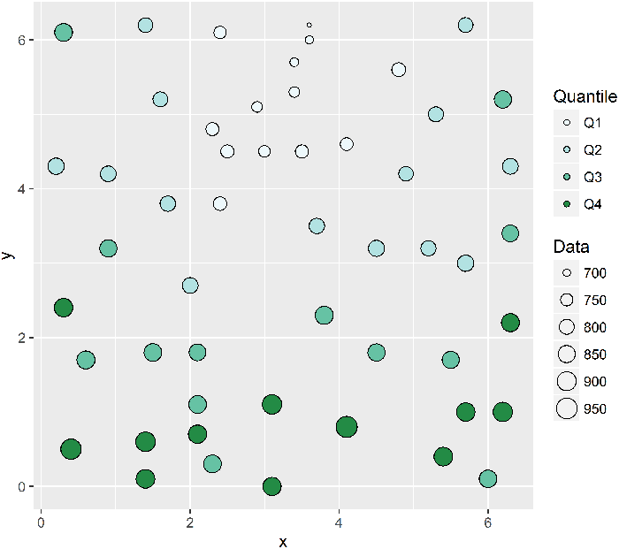
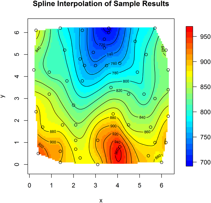
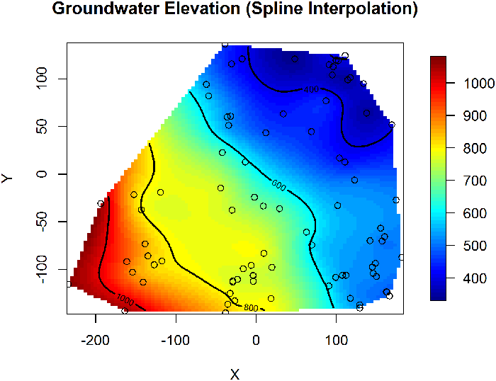
The most common EDA method for geospatial analysis is the mapping of the sample locations and posting of sampling results. The assessment of trends and outliers can be enhanced by a simple interpolation of the data in between sample points. In addition to mapping, traditional EDA methods can be modified to investigate geospatial data:

  • Bin (group) the data into rows/columns (latitude and longitude) and create vertical/horizontal box plots on either side of an x-y scatter plot.
  • Perform a probability plot of Z versus marginal coordinates (latitude and longitude), or probability plots of the bins.
  • Generate 2D, colored scatterplots to help detect outliers.
  • Analyze the scatterplot of data versus the average of m natural neighbors.
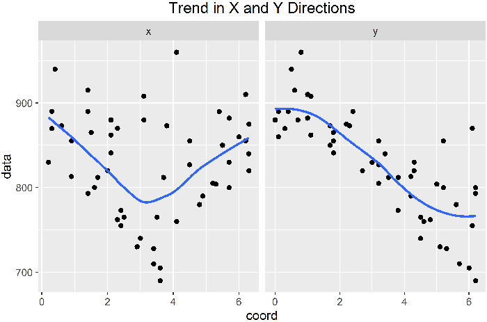
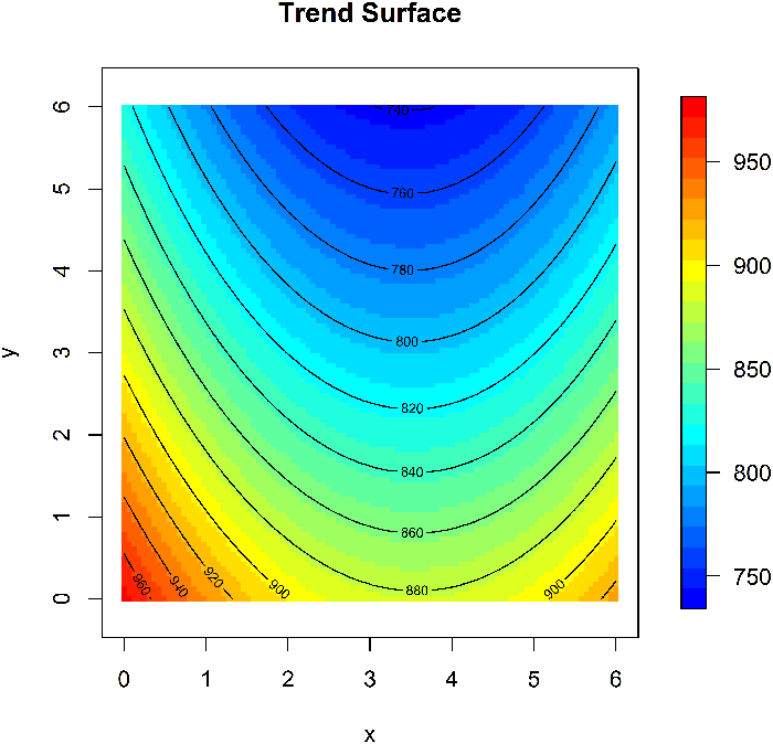
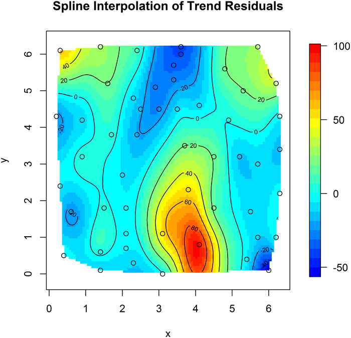
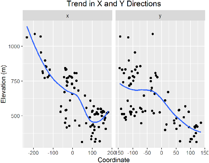
  • Generate a 3D scatterplot. The scatterplot may be difficult to interpret by itself, so add a smoothed surface (such as a penalized spline) to capture general trends and look at the scatterplot as deviations from that trend.
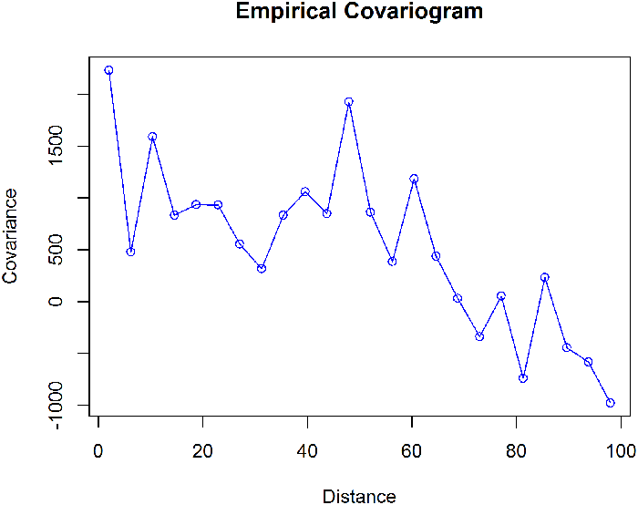
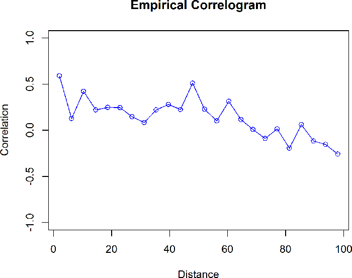
▼Read more

Spatial EDA methods can help to detect outliers that may not be found by standard nonspatial EDA. For example, a data set may range from a low value in the southwest to a high value in the northeast. A general EDA will not catch a data point in the southwest that has a value close to the values in the northeast, even though it may be an obvious outlier when represented graphically as a function of position.

The following series of plots show how trend in the data can be visualized. Figure 26 shows the concentrations measured at sampling locations as different sized circles, with the size of the circle proportional to the concentration. The color of the circle shows the quantile of result. A north-south trend is evident in the map. The trends are clearer when using a spline interpolation with default parameters (see Figure 27). The overall trends in the x-axis and y-axis directions can be summarized using a scatter plot of the data versus each coordinate (see Figure 28). The trend is emphasized by adding a smooth-fit line to the scatterplot.

gro_wf_1

Figure 26. Example map showing trend in data.

gro_wf_2

Figure 27. Spline interpolation showing trend in data.

gro_wf_3

Figure 28. Scatterplot by coordinates showing trend in data.

The scatterplots suggest that the overall trend in the data could be represented using a regression model of second order polynominals of the coordinates. This type of simple trend surface model is often used to remove the large-scale trend from the data before analyzing the spatial correlation. The large-scale trend is removed from the data by subtracting the predicted value of the trend surface from the original data value at each data location. The resulting detrended data are called residuals. Figure 29 shows the trend surface, and Figure 30 shows a spline interpolation of the residuals.

In this case the trend is simply a function of the coordinates, but as part of EDA consider whether there are other types of data available that could be used to better represent the trend. The spatial trend in soil concentrations might be correlated with soil type or distance from a source. Groundwater elevations are often correlated with the ground surface elevation or distance to recharge or discharge areas. See the example of using soil type and distance from a river as explanatory variables for the trend.

gro_wf_4

Figure 29. Trend surface.

gro_wf_5

Figure 30. Spline interpolation of residuals after subtracting trend surface.

Spatial Correlation

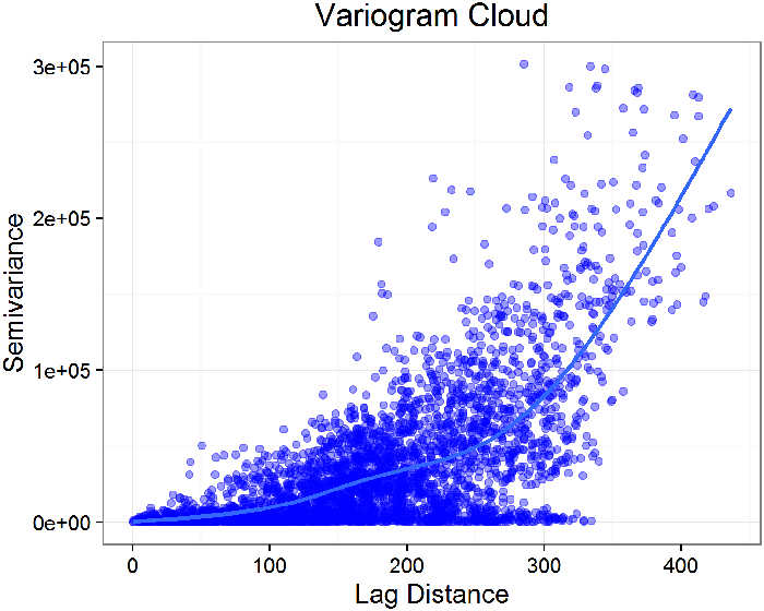
For spatially correlated data, higher correlation is expected for points that are closer together. One of the most important objectives of EDA of geospatial data is to characterize the range of spatial autocorrelation that is exhibited in the data. This range can be used to guide sample spacing or to select an appropriate method to use for interpolation. The variogram is the most common spatial EDA method used to assess spatial correlation. Other methods that can be used include the H-scatterplot and the covariance function plot or correlogram.

Variogram

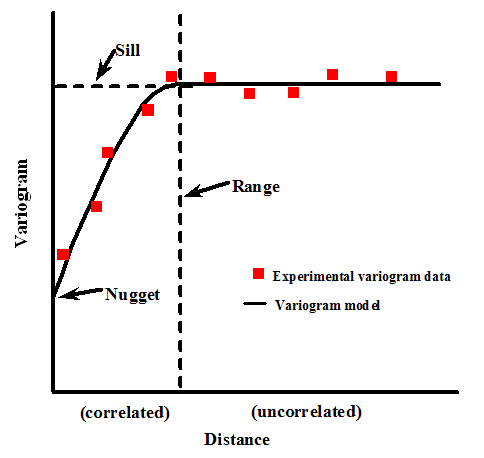
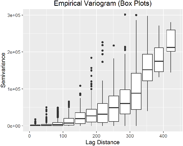
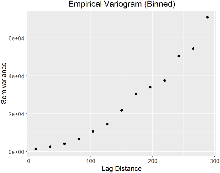
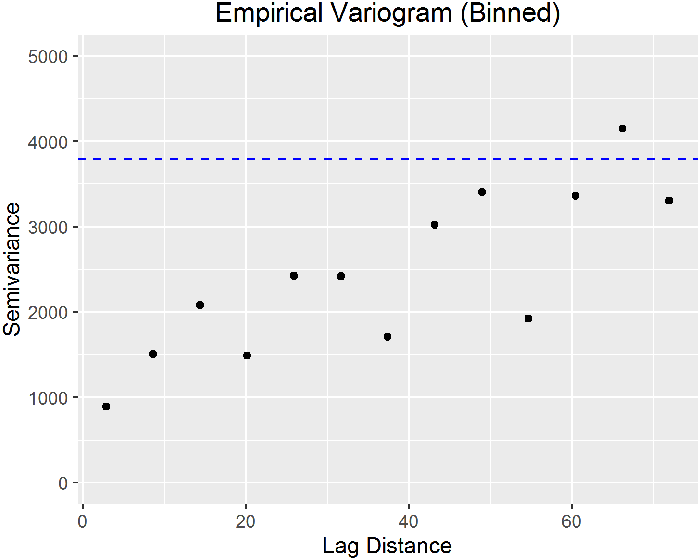
A variogram is a plot of the squared differences between measured values as a function of distance between sampling locations. The variance of the differences increases with distance until the spatial autocorrelation is no longer present (called the sill value). The lag separation distance, or lag value, where the spatial autocorrelation is no longer present is called the range. Thus, at distances less than the range measured values will exhibit spatial autocorrelation. The variogram is also referred to as a semivariogram, because the values are actually half of the variance between two points with a given lag. A plot of half of the mean of the squares of the differences in measured values grouped by lag function of distance is the empirical variogram (also called experimental variogram or sample variogram).

It is also possible to create temporal variograms to explore the temporal correlation of samples collected at a single location. The method to develop a temporal variogram is similar to a spatial variogram, with the lag distances being defined by time rather than distance. Calculating the temporal variogram for each location within a sampling area may contribute an overall understanding of how concentrations vary over time and distance.

Bins

▼Read more

The variogram cloud is a plot of the semivariance of all pairs of data points (y-axis) as a function of the lag (x-axis). For large data sets, plotting all of the points individually can result in a cluttered graph with scatter that may conceal the overall spatial correlation. To simplify the plot, pairs of data points can be combined into groups determined by lag distance, often called bins. The resultant plot has fewer data points and spatial correlation is more easily discerned. For example, data pairs may be grouped into bins with lags of 0 to 5 meters, >5 to 10 meters, >10 to 15 meters. In many software packages, each lag is given as the central distance in the range with a tolerance of ± some distance, often half of the lag. The appropriate bin values are determined by the geographic spread of the sampling locations and the size of the area of interest (see also H-scatterplots for a rule of thumb on lag distance), but each bin should contain 20–30 sample pairs. Other considerations, such as local geology and contaminant source geometry, may help define the lag intervals. It is crucial to choose appropriate class boundaries and sizes for a particular data set. If lag distances are too large or small relative to the sample spacing the spatial variability may not be properly estimated.

Variogram Features

▼Read more

The variogram has three important features: the nugget, the range, and the sill (sill value). The nugget is an extrapolation of the sample variogram to a lag of zero (see Figure 31). The nugget represents measurement errors or spatial variation at distances smaller than the sampling interval. If the variogram reaches a constant value at some distance, then that value is called the sill. The range is the distance after which the variogram values remain at or close to the sill. In some cases, the data can exhibit nested spatial variation, meaning that they exhibit more than one range of autocorrelation at different lag separation distances, or scales.

gro_wf_6

Figure 31. Variogram features.

Source: Matzke et al. 2014

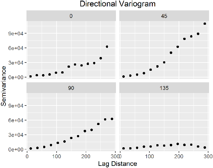
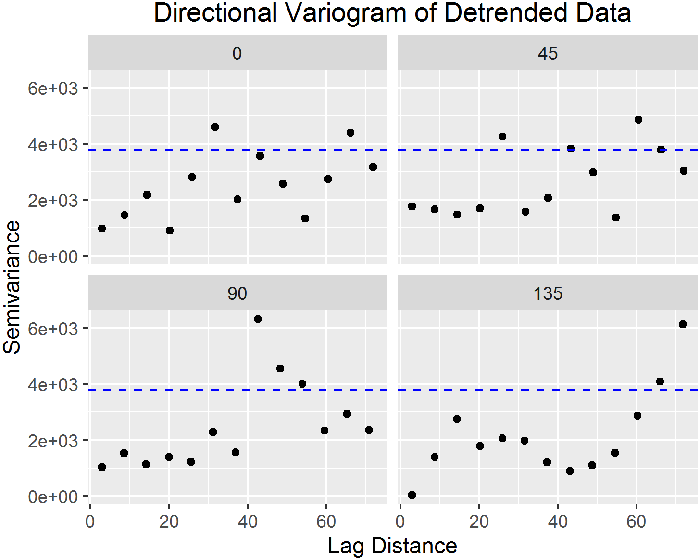
Directional Variograms and Anisotropy

▼Read more

In the initial construction of a variogram, only the magnitude of the lag is considered—not the direction of separation between data points. This approach assumes that the physical characteristics of the sampling area and the spatial correlation of data measurements are the same in any direction, or isotropic. Most often, spatial correlation is anisotropic, or dependent on the direction of separation between two data points in addition to the magnitude of the separation. Directional variograms are used to evaluate spatial correlation in anisotropic environments. A directional variogram only includes data pairs that are separated in certain directions.

Examples

▼Read more

A variogram can provide an effective way to estimate spatial correlation in a set of measured points. An empirical variogram can be created quickly in any geostatistical software package. Because a variogram is easy to create, however, it is also easy to neglect to fine-tune the empirical variogram. Selection of appropriate lag distances, accounting for anisotropy, and identifying the appropriate measurements to include in the variogram require scrutiny of the data and some understanding of the local geology, hydrogeology, and other factors that may affect spatial distribution of the contaminant (such as multiple sources).

In the following example, the data are water levels collected from 85 wells located in the Wolfcamp Aquifer in Texas (Cressie 1993). A spline interpolation was used to display the data for EDA purposes in Figure 32. As expected for water level measurements, there is a clear trend in the data reflecting the groundwater flow direction towards the northeast. The trend can be clearly seen in the both the x- and y-direction in Figure 33.

gro_wf_7

Figure 32. Spline interpolation of water levels.

gro_wf_8

Figure 33. Trend plot.

The analysis begins by evaluating the empirical variogram cloud. There are 85 points in the dataset, so there are 3570 points in the variogram cloud (the number of ways to pair 85 points). The large number of points makes it difficult to interpret the variogram cloud, so a smooth line is added to represent the average values (Figure 34). More commonly, the variogram is simplified by grouping the points at similar lag distances into a small number of bins. The next plot shows boxplots of the semivariance with 13 bins for lag distance (Figure 35). A general rule of thumb is that largest lag distance shown on the variogram should be no more than half the maximum site dimension. In Figure 36, only the average semivariances at binned lags up to 300 km are shown.

In many cases, the spatial correlation of environmental data exhibits anisotropy, meaning that spatial correlation is stronger in some directions than others. The variogram can be used to detect anisotropy by constructing multiple variograms with data point pairs restricted to a range of directions. Typically, four directions are chosen, such as 0, 45, 90, and 135 degrees as shown in the Figure 36. In this case, 0 degrees corresponds to due east and the other directions are measured counter-clockwise from due east. As with lag distance, the specified direction actually represents the center of a range or bin of directions. For example, 90 degrees includes 90 degrees plus or minus 22.5 degrees. There is clear evidence of anisotropy in the variograms shown in Figure 37, with the highest level of spatial correlation in the 135 degree variogram that is perpendicular to the direction of groundwater flow.

gro_wf_9

Figure 34. Variogram cloud.

gro_wf_10

Figure 35. Variogram box plot.

gro_wf_11

Figure 36. Variogram with bins for lag distance.

gro_wf_12

Figure 37. Directional variogram.

The trend in the water levels causes the semivariance to increase with increasing lag distance with no upper bound. As a result, it is difficult to evaluate the spatial correlation range from the variogram based on the original data. Detrending the data and then examining the variogram of the residuals simplifies this evaluation.

To detrend the data, a low order polynomial trend surface is typically used. In this case, a linear trend was sufficient. The variogram of the detrended data is shown in Figure 38. Now the variogram is no longer unbounded. A blue dashed horizontal line shows the overall variance of the data on Figure 38. The semivariance reaches the value of the overall variance at approximately a lag distance of 60 km. Thus, the range of spatial correlation is approximately 60 km. This value of the range could be used to help guide the selection of additional well locations. After detrending, there is no longer much indication of anisotropy in the directional variograms shown in Figure 39.

gro_wf_13

Figure 38. Variogram of detrended data.

gro_wf_14

Figure 39. Directional variogram of detrended data.

Other Methods

Other methods for assessing spatial correlation include H-scatterplots and plots of the covariance function or correlation.

H-scatterplots

The H-scatterplot, also called the h-scattergram or lagged scatterplot, is a tool for evaluating spatial correlation within a data set. It is a plot of the measured values for pairs of data points. For a given lag, or separation distance, measured values at each location are plotted against measurements from locations separated by that lag. The degree of scatter in the resulting plot graphically displays the degree of correlation between points with the specified lag. Examples of H-scatterplots are shown in Figures 63 and 75, in the Regression Example section.

▼Read more

For a data set, a set of lags are selected based on sample spacing and the dimensions of the sampled area. One rule of thumb is that the number of lags multiplied by the lag distance should be about half the largest distance among all points. If possible, the lag distance and number of bins should be selected so that each lag bin ideally contains at least 20–30 sample pairs.

For each lag, measured values at data point pairs with the given lag are plotted. For each data pair, the measured values are the coordinates plotted on a Cartesian coordinate system. These two points define a lag vector and are often referred to as the tail and head variables, with the tail being the first point of interest and the head describing the point that is at the other end. A line with a gradient of 1 (equation x = y) is drawn through the scatterplot. Visually, points that are clustered closer to the gradient 1 line have a greater degree of spatial correlation. For spatially correlated data, as the lag increases the scatter would also be expected to increase. For a quantitative evaluation of correlation at each lag, the correlation coefficient can be calculated.

Covariance and Correlation

Covariance and correlation are both measures of the similarity of the data values at different separation distances (lags). These measures are used to evaluate the spatial autocorrelation of the data. Correlation is a version of covariance that has been normalized so that the value is between -1 and 1.

▼Read more

A plot of the correlation between pairs of data points versus lag is referred to as the correlogram. A plot of covariance versus lag is generally referred to as the covariogram. Examples are shown in Figures 40 and 41.

Generally, it is necessary to experiment with different lag distances and directions in order to find the combination that accurately characterizes the data. The correlogram and covariance plots are most useful on data sets that either do not have an overall trend or which have been detrended.

gro_wf_15

Figure 40. Empirical covariogram.

gro_wf_16

Figure 41. Empirical correlogram.

image_pdfPrint this page/section


GRO

web document
glossaryGRO Glossary
referencesGRO References
acronymsGRO Acronyms
ITRC
Contact Us
About ITRC
Visit ITRC
social media iconsClick here to visit ITRC on FacebookClick here to visit ITRC on TwitterClick here to visit ITRC on LinkedInITRC on Social Media
about_itrc
Permission is granted to refer to or quote from this publication with the customary acknowledgment of the source (see suggested citation and disclaimer). This web site is owned by ITRC • 1250 H Street, NW • Suite 850 • Washington, DC 20005 • (202) 266-4933 • Email: [email protected] • Terms of Service, Privacy Policy, and Usage Policy ITRC is sponsored by the Environmental Council of the States.